
User Experience starts and ends with, well, you. The user. It’s your experience. There was a time when we would walk away from silly, mundane things like typing up an email or opening up the gallery with a little smile and an urge to do it again. It was fun. It was new. And it was fun. That’s it. That’s the pinnacle of User experience, we can all go home now.
Over the years, we’ve seen advances in user interaction. Touch screens were a big one, yes, but Windows Aero and Mac OS 10.0 came around and showed the world what was possible with interface design alone. Soon after, young and bright engineers/designers at Google and Apple popularized the world of Voice assistants, material design, gesture based interaction and most recently the world of VR and Augmented Reality.
Where do we stand
Technology is only as useful as the buttons we are able to push to use it. Talking is a lot faster than typing, for example, and with virtual assistants evolving into a household brand, we’re getting a lot more buttons to push.
Virtual Assistants
Smartphones can hear the purr of your vocal ensemble and the abruption as you finish your thought. In fact, they seem to be itching to prove their auditory acuity, as conversationally targeted advertising is quickly becoming a meme.
While Google’s Nest smart speakers have been selling for a while now, Apple has only just entered the market with their own smart home speaker. For many, the Apple HomePod signifies the end of the ritualistic cry to “Hey Siri” and embraces a gentle summons from the comfort of the living room. As if to complement the simplicity of the smart home, TV remotes have been steadily shrinking. With the Chromecast, Amazon Fire and even Xiaomi Mi TV controllers offering little more than 5 navigation buttons and volume rocker. The general trend seems to be letting us tell a virtual assistant what we want and let them figure out how to get it to us.
Subscribe and be free
YouTube, Google and Facebook are among the top visited websites in the world. All three of which started as free-to-use services for the public. All three of which now use an advertising model the likes of which has never been seen before. But only one (YouTube) will let you pay for an ad-free experience.
While not new, the “Subscribe to remove ads” button has swept the mobile market and even touched some of Big Tech. Developers can’t work for free, but most users don’t want to pay for software that only solves a minor inconvenience. With the subscription model, developers can get paid through willing customers with open wallets, but also through advertising. It’s effectively a win-win and a great way for developers to support doing what they love.
Motion design
VR ⇾ AR
Design ethics
VR and AR
Snapchat filters. Instagram filters. FaceApp.
Augmented reality sneakily crept into our everyday lives. Not only is the technology here to stay, it’s improving at something of a rapid pace. The iPhones and iPads have already had a pretty good AR experience. But Apple took their technology a leap further by introducing LiDAR into the hands of the public. What that means is the iPhone 12 Pro can take a photo in 3-dimensions! (albeit slowly and with a lot of panning). Computers have been able to accomplish this feat in the past with some clever computer vision software tricks, but not like this.
Computer Vision typically takes a long time to process an image, and the results are mostly-decent. LiDAR cuts away all that processing to deliver precise, usable depth information at near real-time speeds. The iPhone can even map what it sees into a virtual 3D world.
Let’s take a step back for a second and cover some exciting trends in the user interface space first. We’ve had material design since 2014 thanks to the design innovators over at Google. We’ve seen some noticeable additions to the trend, such as the strong gradient material design. But nothing has quite blown my socks off like Glassmorphism.
Glassmorphism
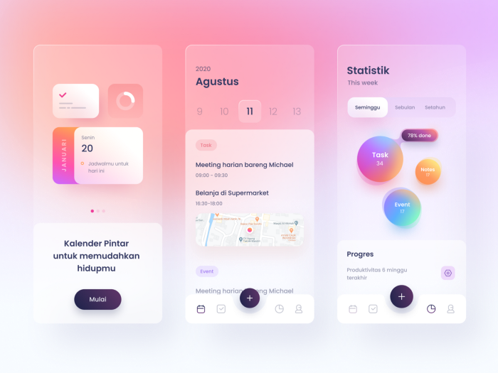
Designers have taken the best of the glass era of Windows Vista and macOS 10 and combined it with modern material design. Creating an effect that Michal Malewics dubs “Glassmorphism”. This effect involves creating what look like material design components. But then adding a frosted glass style blurred background. As a finishing touch, throw in a 1px light transparent border to give it a real shimmer. Michal notes that the effect works well as a background element and can fall apart if used excessively.
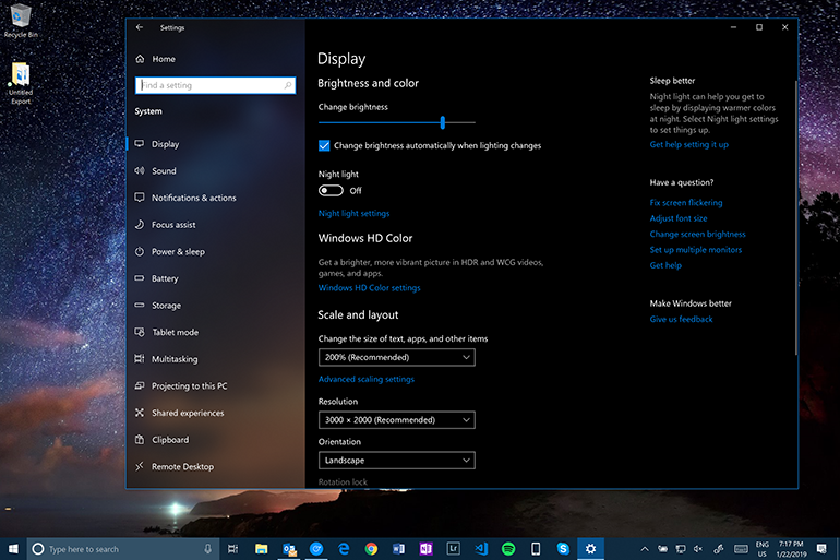
We’ve seen this trend from Microsoft on some of the windows elements (Notably the settings) as part of their fluent design. Microsoft is preferring to call it acrylic however, lending to their effect having what appears to be a white (or black) transparent layer above the glass.
It’s worth noting that while iOS has been using blurry backgrounds for a while, their effect is missing the white border and drop shadow that the material design brings to the table.
Neomorphism – An honorable mention
Michal Malewics wrote about Neomorphism on a blog post about a year ago. The concept this time was to have a solid brick of plastic or clay from which you would mold your UI out of. Michal designed the image above showing the concept while addressing the accessibility issues with this design. The lack of contrast between elements, ultimately predicted its demise. He wrote the article about Glassmorphism roughly a year later.
Motion Design
Animation from Eddie Lobanovskiy on Dribbble.
With price-to-performance dropping dramatically over the last few years in low-end mobile devices, developers can no longer rely on “It needs to run on less powerful phones” as an excuse to avoid epic animations and motion guided user interaction.
Animation from Jakub Antalik on Dribble.
Motion design is a way of telling people how to use the app without saying “You need to click here”. The language is familiar to all humans without needing a translation layer or separate help file. Not to mention, a subtle animation can inject a personality into a brand that can be backed up in the marketing to make an application that is truly yours. It adds so much flare and wow-factor to an app that easily sets it apart from current-gen designs.
3D design
We live in a 3D world. The breeze blows through 3D trees, and we walk through the hole in 3D doors. Yet, most of how we interact with software is in the 2D plane. I’m sure that’s why we find 3D presentations so eye-catching. They help us feel comfortable on any user interface and are a great way to add a centerpiece to an app. This trend has become increasingly prevalent in 2020
Voice Interaction
Is talking to your computer a viable replacement to the legacy of actually touching things? Apple, Google and Amazon have invested heavily in voice enabled technologies. And yes, they are actually good. They are not so good that you could replace your phone entirely with a mini, portable Amazon Alexa. But they are so good that you can use Google Assistant while driving to do any of the tasks that would typically distract you. Need to respond to a message (On WhatsApp!), change the music or search for the nearest petrol station while you drive? Hey Google, Hey Siri and Alexa have you covered.
So where to from here?
Voice recognition is only getting better. Bookmarkcontent (Bookmarkcontent, 2020) shows an uptick of virtual assistant use in the home. Particularly in the living room. As if users are trying to escape the constant interaction with their devices as they power down for the day. Smart speaker units are trending upwards, with Bookmarkcontent predicting over 500 million smart speakers making their way into households before 2023.
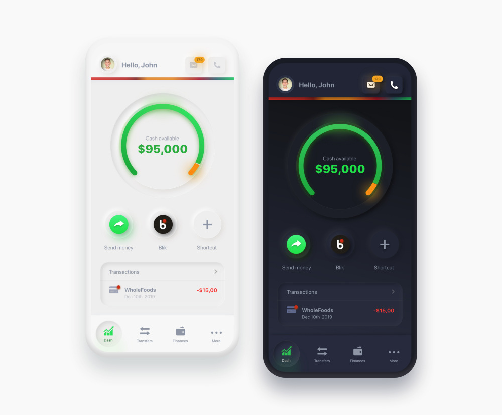
DARK MODE
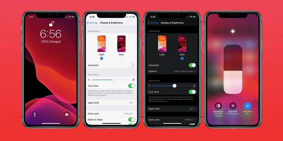
What is the point of a beautiful waffle and ice-cream stack if you can’t see it? Dark theme has proven that it’s here to stay in 2020. Fuelled by a push to put health and eye-strain prevention above aesthetics to make sure your visual acuity is in tip-top waffle viewing shape. WhatsApp, Instagram, Facebook and even both Android and iOS have hopped onboard this trend with no indication of getting off any time soon.
A Dark mode is an optional switch from using dark text on a light background to using light text on a dark background. And it’s so good. For many reasons, too. For one, users now have a high degree of control over the look and feel of their device. Dark themes are by no means ugly, often quite the opposite. Yes, it is good enough to bait you with waffles in the heading. The ability to toggle the dark mode based on the time of day also saves me from being greeted by a blindingly bright screen when I open my device to a new message in the middle of the night.